


Media queries let one stylesheet apply different styles depending on the device, viewport, or the user’s own preferences, which is what makes a single page work everywhere. This cheatsheet gathers the whole toolkit on one page, from min-width and max-width through mobile-first ladders, combined conditions, orientation, retina assets, dark mode, and reduced motion, each snippet annotated line by line. Keep it open while you build, or save the image and pin it nearby.
For the full background, read the guide to CSS media queries. To practise, work through the 10 code-along examples.
Download the cheatsheet
Hope this is helpful.


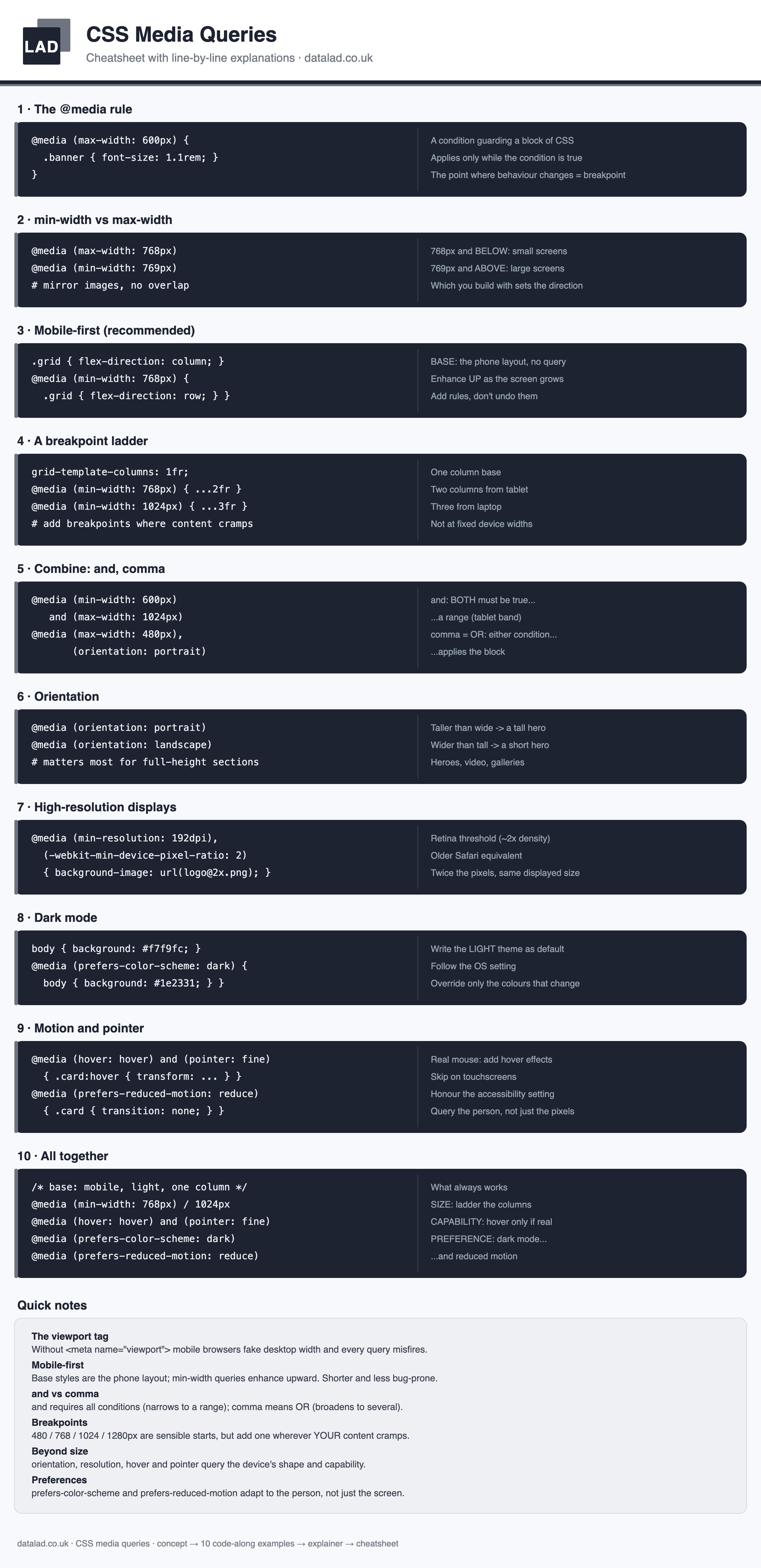
[…] CSS Media Queries Cheatsheet […]